You know that feeling when you’ve been working on a project for what feels like forever, and then it finally comes to life in the most incredible way?
Well, that’s exactly what happened with our recent collaboration with Breakbulk (part of the fantastic Hyve Group). We, the slightly crazy but very creative team at Gobenanas, had the opportunity to Breakbulk and unveil their new brand at the flagship show in Rotterdam this year. Buckle up because this journey was one for the books!
To provide some context for those who aren’t familiar with the logistics industry, here is what the and segments are:
Breakbulk is anything that has to be handled as a piece with a crane and cannot be put in a container.
Project Cargo generally describes the handling and transportation of dimensionally challenging, heavy, complex pieces of equipment, which often includes engineering, extensive planning, and specialized transport equipment.
Let’s rewind to nine months ago when Leslie Meredith, Breakbulk’s marketing director, approached us with an audacious vision: They wanted to shake things up, breathe new life into their brand, and stay ahead of the game in the logistics industry. We accepted the challenge knowing it wouldn’t be easy, but with our passion for design and marketing, we dove straight in.
We broke this project down into four steps: Investigation & Strategy, Design and Implementation.
Step one: investigation & strategy
This is an exciting stage (and one of Benjamin’s favourites). We immersed ourselves in the shipping and Project Cargo industry, absorbing as much information as we could along the way. We wanted to understand their story, values, and their aspirations. Working closely with Leslie, who generously shared her insights, dreams, and even a few hilarious anecdotes about the industry, we kicked this off by asking a tailored set of questions to the major stakeholders in the project. This provided us with a baseline insight – our first step to understand what this project is about and what their needs and requirements are.
Then, we evaluated the answers, looking for patterns and commonalities: repeatedly mentioned aspects, similarities in the client’s responses, and words that stimulate visuals – creative triggers – colours, thoughts, memories, and written articles with similar relevance. It’s part of the side designers sometimes find hard to explain and justify to others – the space we need to stir up the visual stimulation into tangible ideas (but that’s for another article!).
Armed with this knowledge, we hit the internet, exploring different creative avenues through Google, Pinterest, Behance, and Dribbble, to name a few. We looked for further triggers on how we could expand the initial stimuli. What we found here is that certain aspects start to reveal themselves. As we have already steered our brains with the answers to the initial questions, our creative brains look for these avenues – transcribing to kindle for creative routes.
With the research and strategy approved, our team of creatives locked themselves in a room (okay, not literally) and let their imaginations run wild.
Exploring various concepts, colour palettes, and logo designs. We pushed boundaries, ensured we were not being governed by any rules (there are no rules to abide by in branding), and challenged conventional industry thinking to create a visual identity that would captivate both the industry and Breakbulk’s values. It wasn’t easy (it shouldn’t be, really), and there were definitely moments of frustration and “What on earth are we doing?!” But we struck gold through collaboration, trial and error, and countless cups of coffee. The new Breakbulk brand was born—constructed of strength, scale, and rigour.
Step two: design
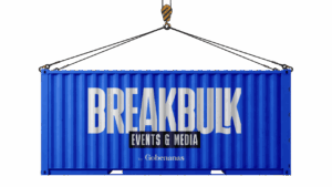
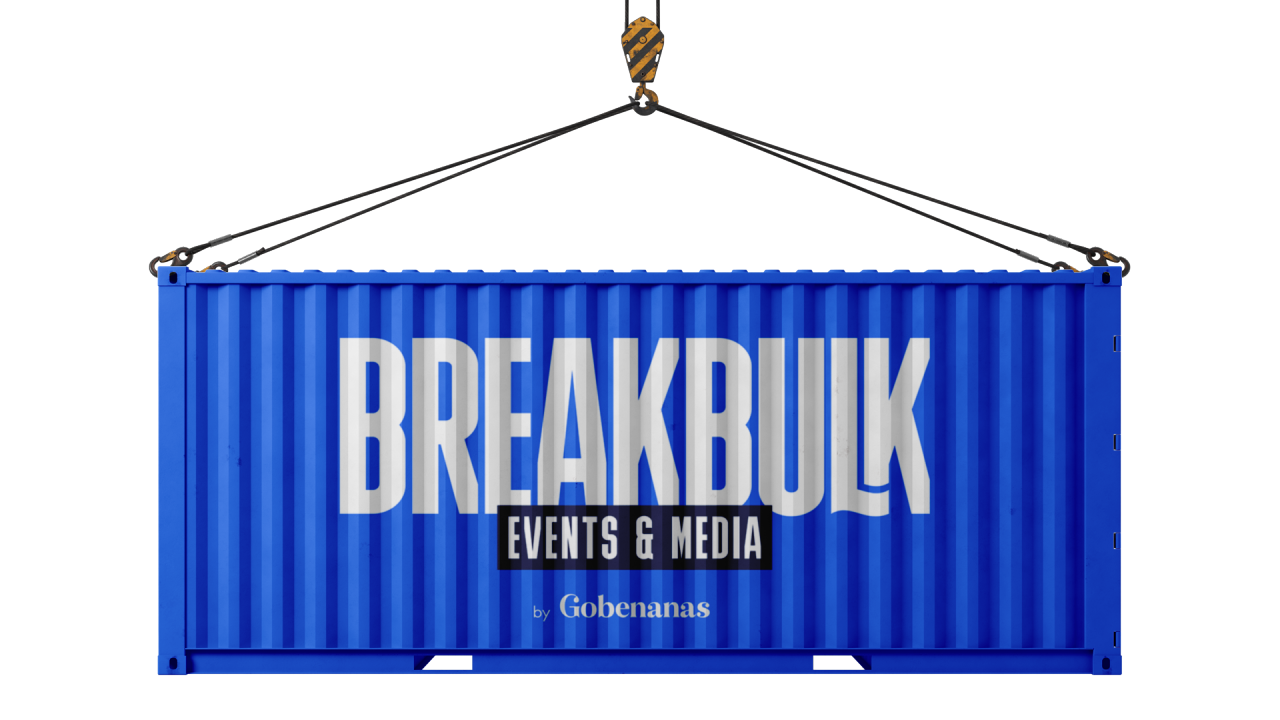
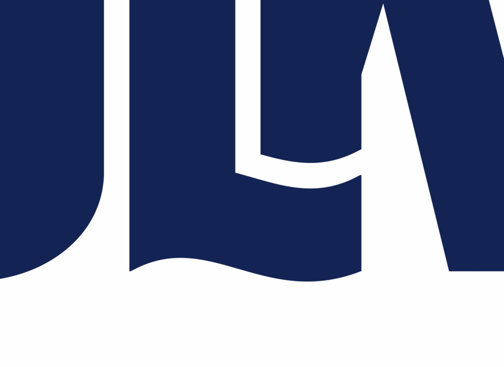
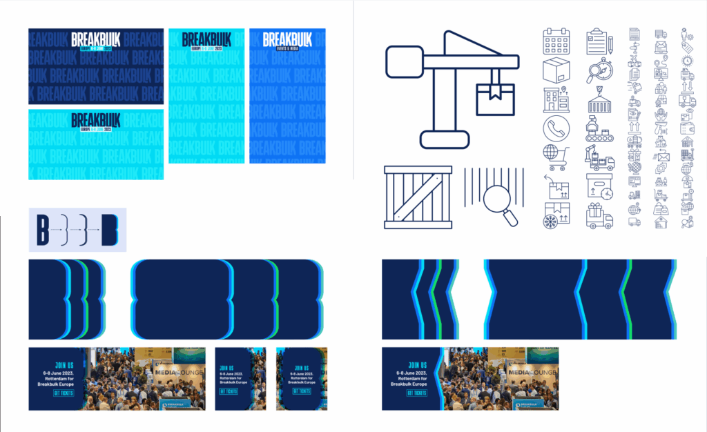
The logo has been created as a graphic and typographic symbol of the Project Cargo industry. The positive and negative spacing indicates the awkward, complicated subjects that are moved around the world.
We created a brand that reflects the industry: It needed to look big, bold, sharp, and strong. Using the font Bulevar as a base, we created our raw logo.
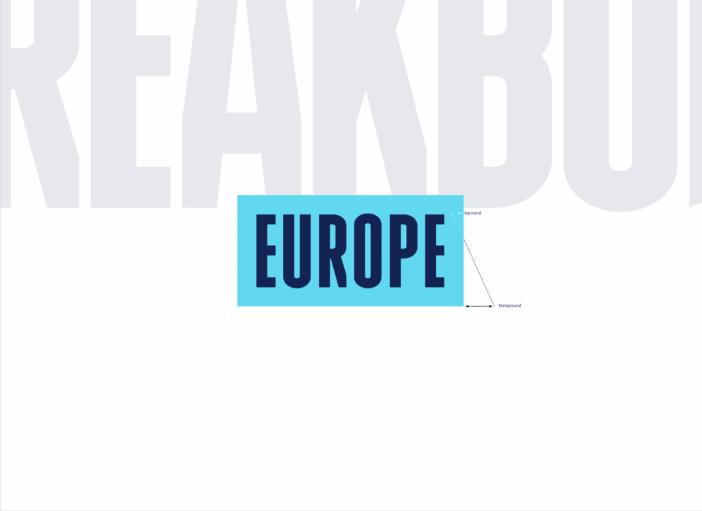
But what about scale? This industry is all about size and how they move awkward pieces around the world. So, how do we reflect the sheer size of these projects? Well, first, we needed to understand some basics of how scale really works and is portrayed in a flat, 2D environment. So, the best place to look, we figured, is at photography. Photographers use a point of reference in imagery to invoke a sense of the scale, usually using a person or other familiar objects. We wanted to take this principle and apply it to the Breakbulk brand – but we needed to be subtler…
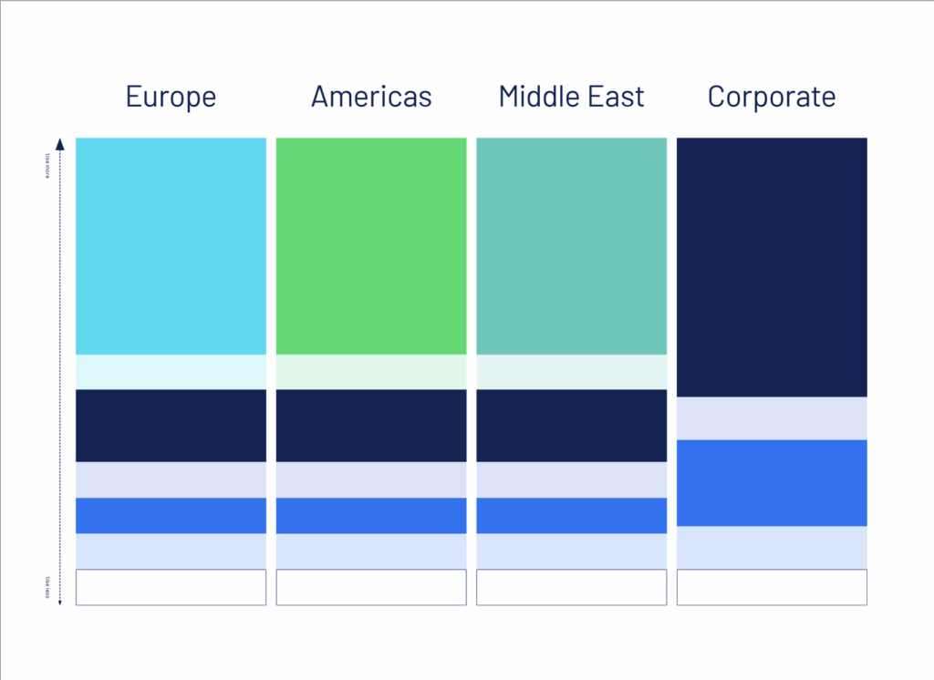
Breakbulk has a series of sub-brands that we can utilise, especially for their core shows.
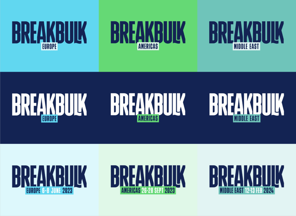
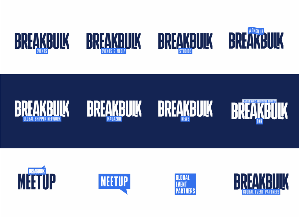
Differentiating between the raw logo and the sub-brand by boxing out the sub-brand and then overlaying the location subtly applies this photography principle and gives the audience the context for the Breakbulk logo to feel much bigger. It’s like the sub-brand is in the foreground, and the raw Breakbulk logo is in the background.
But we didn’t stop there. The brand needed to reflect the essence of the maritime industry. We did this by adjusting the leg of the L and moving the end K behind. This tightens up the logo, makes it feel more cohesive, and adds yet another layer of depth to the logo, elaborating the scale further.
But a brand is more than just a logo. It’s a story waiting to be told. So, once the direction had been signed off, our designers rolled up their sleeves and got to work on how we could bring this brand to life.
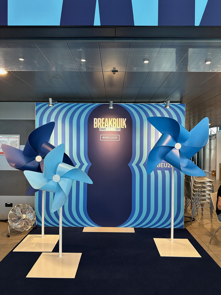
Colours were chosen to reflect the key maritime side of the industry while still complying with clear contrast ratios and being colour-blind safe. Each of the three shows has its own colour, along with an overarching corporate colourway. We added rules for usage so as to keep assets feeling consistent throughout creation.
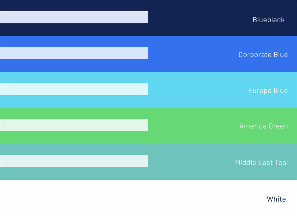
Bulevar was chosen as the main font for its perception of strength and scale. It reflects the Project Cargo industry: enormous, variable, confident, structured. We added a rule that it only be used in uppercase, so it keeps applying its visual strength to all Breakbulk’s assets.
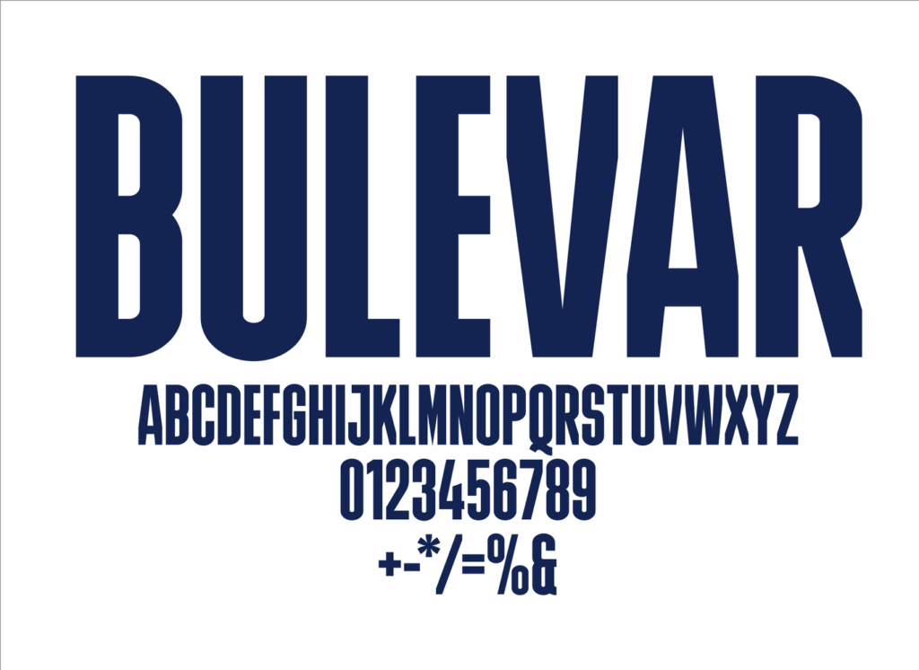
Barlow was chosen as the body copy. It is a perfect juxtaposition with its slightly softened edges and defined familiar letters to Bulevar.
Step three: implementation
Once the core assets were baked in, we shifted focus to the rollout and how these all create the sum of Breakbulk. This is also the time to interpret the core assets into other graphic assets that utilise this core visual language. This is important as brands can become stagnant very quickly if there is not a library of assets to work with.
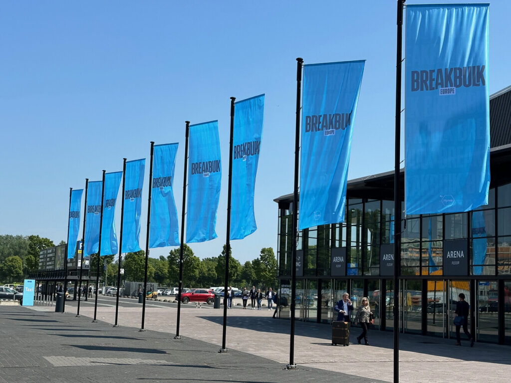
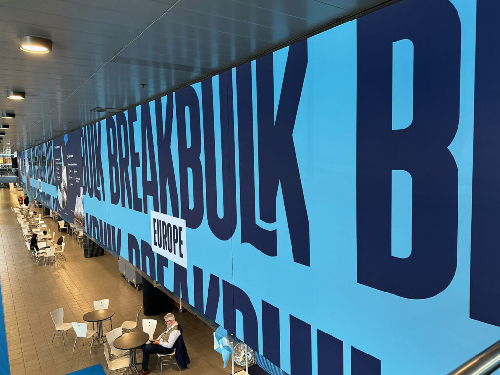
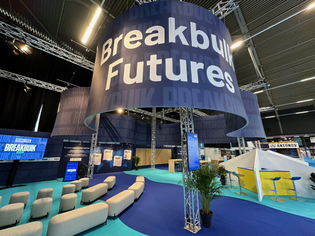
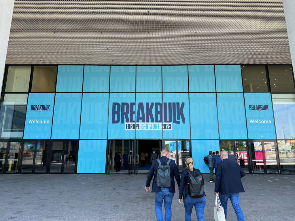
And then came the big day: The Europe show in Rotterdam – the perfect stage for the grand unveiling. We transformed the event venue into a vibrant wonderland, immersing attendees in the new Breakbulk experience. The buzz in the air was palpable as people were eager to explore the revitalized brand. It was a moment of validation, knowing that our hard work had paid off and that the industry was embracing the transformation.
We worked with the Gobenanas team on the rebranding of our event and it has definitely been transformed. From our first initial kick off meeting, the team listened, understood the requirements and delivered back a concept with a story, helping shape the direction of our portfolio. This being the second project we have worked together on, the experience is consistent, smooth and the attention to detail on every element from digital to print is always the highest priority.
Uliana Zeneli, Head of Operations at Breakbulk and CWIEME